I mean, who comes up with this stuff? Let's take a look at my page. Here's what the top looks like from my point of view:
At the top, we see the Admin Panel. This is useful as it keeps track of your notifications and some other choice stats. Then comes what I like to call the "Take This Tour" box. I love to ignore it. There's also an "Add a Cover" button, which I haven't had time to look at yet. If I happened to have an awesome panoramic picture, I could use that. Only problem is, we humans tend to go up/down, not left/right. Maybe I can find a picture of me lying on a bed.
Then I assume what comes next is what you would see if you went to my page.
First off, what's going on right where that red arrow is pointing? There's something behind those boxes, but I can't see what it is.
Now this is where Timeline gets to be confusing. First, under the banner stuff, we have the "Highlights" section. I have no idea what this means. It shows my friends who Like my page. It looks like it shows my most recent post to the left (playing the piano). To the right is something I wrote back in October last year. Why it's there, I'll never know. And there's my cousin's post right under it. Hey Cous! Your post may be immortalized in my Timeline!
Let's go further down the page...
It took me a while to realize that the line going down the middle is the "timeline." The most recent posts are at the top, and later posts at the bottom. But note how the boxes alternate between going to the left and right. Wait--there's another name for this ... BUTTERFLY BALLOT. Yes, we now know that a Florida Democrat designed this Timeline!
Oh, I'm not sure why my Avengers Review shows up twice. It looks like RSS Graffiti messed up. Not Facebook's fault--right?
Scrolling down a little more ...
See that "See More Recent Stories" button? It appears between my May 8 Avengers post and the April section. So, what exactly does "more recent" mean in this context? My latest post is already at the top (the piano one), and you can't get more recent than that! If I click on the button ...
... I have no idea what happened! Now I'm in the middle of April for some reason. Plus, I don't get a good sense that I'm seeing all of the posts. The layout is so counter-intuitive! For example, what's that big gray space in the lower right side? And why is it talking about the 2 "people who like this"? What is "this"?
And I haven't even gotten to the most annoying thing about Timeline ... the skinniness of the posts. Check out what happens when you have a medium size picture...
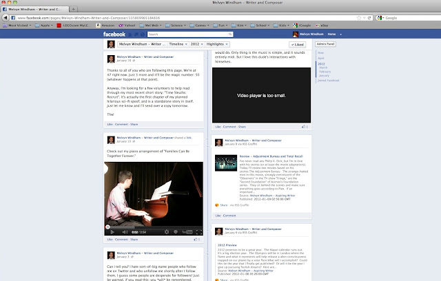
That Writer picture is chopped off. If you click on it, you can see the whole pic in some kind of popup window, but with the old News Feed, you could usually see the pic without having to click on it. How about videos? Let's see...
First, on the left, note the two videos where the arrows point. Then look on the right, which shows what happens after I click on the videos. One video works, but the other doesn't. The broken one says "Video player is too small." Well, that's just nice. Now no one can see that video on my page because there isn't enough space. It used to work. Does that count?
And if I try expanding the horizontal space to get more room, what happens?
Yes--we get lots and lots of useless gray space around the sides and that one video still doesn't work.
The only thing I like about Timeline is that anyone can access any post no matter how old it is. The only problem, though, is ... good luck finding it.
My suggestions: make the interface more intuitive and easier to use (both as an Admin and as a page viewer). Do away with the BUTTERFLY BALLOT format and bring back the usual chronological-order News Feed. Let there be more space so that we can see pictures without having to click on them and videos can have enough room to function. Add a search feature that can help a viewer search for a desired post by keyword. Don't litter the screen with stuff that may make sense to Facebook developers but not to us everyday folk (like quizzical "more recent stories" buttons that act weird and boxes that people Like for no apparent reason).
Timeline as it stands now is confusing and a possible deterrent to viewers. I hate to say it, but I'm seriously thinking about taking my page somewhere else. Google+ perhaps?


